DTS Phorus App Concepts (2014)
As the lead UX designer at DTS, I sometimes take the liberty to independently work on app concepts, time permitting. In the summer of 2014, I worked closely with my graphic design colleague to create a dozen or so concepts for a new music player app for our sister company, Phorus. I'm a big fan of Phorus' Play-Fi multi-room audio technology platform, so I thought it would be fun to work on some app design concepts. Think of it as unsolicited fan art for a sister company. I'm glad to say that these design concepts were well received and appreciated, but they have their own engineering and design team. Posted here are screen mockups created by the graphic designer who worked with me on this project.
In approaching this fun concepting project, my primary goal was to create a wide variety of design directions by focusing on the same two screens for each: one screen for Pandora, and one screen for an Internet Radio station. Because the Play-Fi app offers an integrated multi-service experience supporting an ever-expanding list of music services worldwide, I was also explicitly exploring a design system whereby a single "Now Playing" screen template could work for any streaming service, such as Pandora, Rhapsody, Deezer, KKBOX, and so on. Of course, the screens also needed to be visually engaging and feel like they celebrate the music, as well as being easy to use.
It should be noted that each design implied a different approach to its site map (screen hierarchy) based on such factors as presence of navigation controls, how the Now Playing screens were accessed, how the user might switch music services, and so on. I had the site maps worked out reasonably well in my head already, and intended to document them had any of these concepts been selected for further exploration.
My Role: Lead UX designer and art director. Deliverables included a presentation of inspirational apps and wireframes for more than a dozen different concepts. The graphic designer executed the high resolution screen mockups shared here.
Concept A: Home Screen
I liked this concept a lot, so we gave it a Home Screen in addition to Pandora and Internet Radio screens. As people are creatures of habit, I wanted to make it easy for users to easily view a list of the last handful of channels that they'd listened to, regardless of service. Hence the "Recently Played" section on this screen. With this project, I introduced sleep timer and alarm features, as I have many friends who like to listen to radio when they go to bed. To access the "Now Playing" screen, hit the big animated EQ button in the bottom navigation bar.

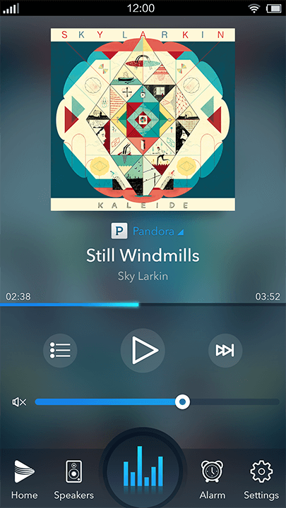
Concept A: Now Playing Screen (Pandora)
A visually engaging screen leveraging the album artwork to provide the background texture. This particular screen lacks the Like, Dislike, and Bookmark buttons that typically appear in a Pandora app, but we planned on addressing the issue in a future iteration if this direction were chosen.
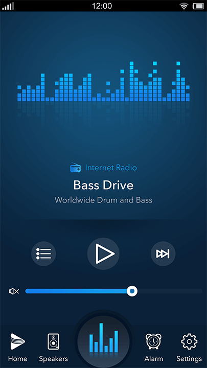
Concept A: Now Playing Screen (Internet Radio)
Internet radio stations rarely make available album artwork, so instead this screen displays an animated EQ design. The station ("Bass Drive") and constantly changing info text supplied by the station are displayed prominently.
Concept B: Now Playing Screen (Pandora)
This concept shows the full range of both standard music controls (like Play and Next) as well as service-specific controls, such as Like, Share and Bookmark. This screen could be easily adapted to work well for multiple services.

Concept B: Now Playing Screen (Internet Radio)
Internet radio stations rarely make available album artwork, so instead this screen displays an animated EQ design. The station ("Bass Drive") and the genre are displayed prominently.

Concept C: Now Playing Screen (Pandora)
This concept moves the service-specific controls (e.g., Like, Dislike, Bookmark) into the album art area, a design which is echoed on the Internet Radio version of this screen. We did both dark and light versions of this screen.

Concept C: Now Playing Screen (Internet Radio)
This design is inspired by Dieter Rams. We did both dark and light versions of this screen, as well.

Concept D: Now Playing Screen (Pandora)
With this concept, I wanted to mix things up a bit. In addition to putting the volume control on an angle, the current progress in the track is displayed around the edge of the circular area displaying the album artwork.

Concept E: Now Playing Screen (Pandora)
Here's a rather far out, but kind of fun, design. The audio playback controls would be displayed on the bottom half of the circular area, with the service-specific controls on the top half. The playback progress encircles the album art, and is echoed in the elliptical design of the volume control area at the bottom. I doubt that this design would be a crowd pleaser, but it was fun to work on, too.

Concept F: Now Playing Screen (Pandora)
Here's a fairly minimalist design. The speaker and hamburger menu overlays on the edges provide access to additional features. The user can also tap on the channel name at the top ("Hipster Cocktail Party") to pivot to a different channel within the same service.
